Year
2025
Keywords
UX/UI, data visualization, interaction design
Medical Trends Visualization
UX/UI for a digital experience that visualizes cardiology trends

Problem
Data-heavy experiences can drive engagement – or cause information overload.
In 2025, a digital healthcare education company aimed to deliver fresh, data-driven experiences for healthcare professionals. One initiative involved exploring ways to present national medical trends through an interactive experience.
HMW Question
How might we leverage data-heavy content while maintaining good UX?
Solution
Transform raw data into an intuitive experience with visualizations & tools that encourage exploration.
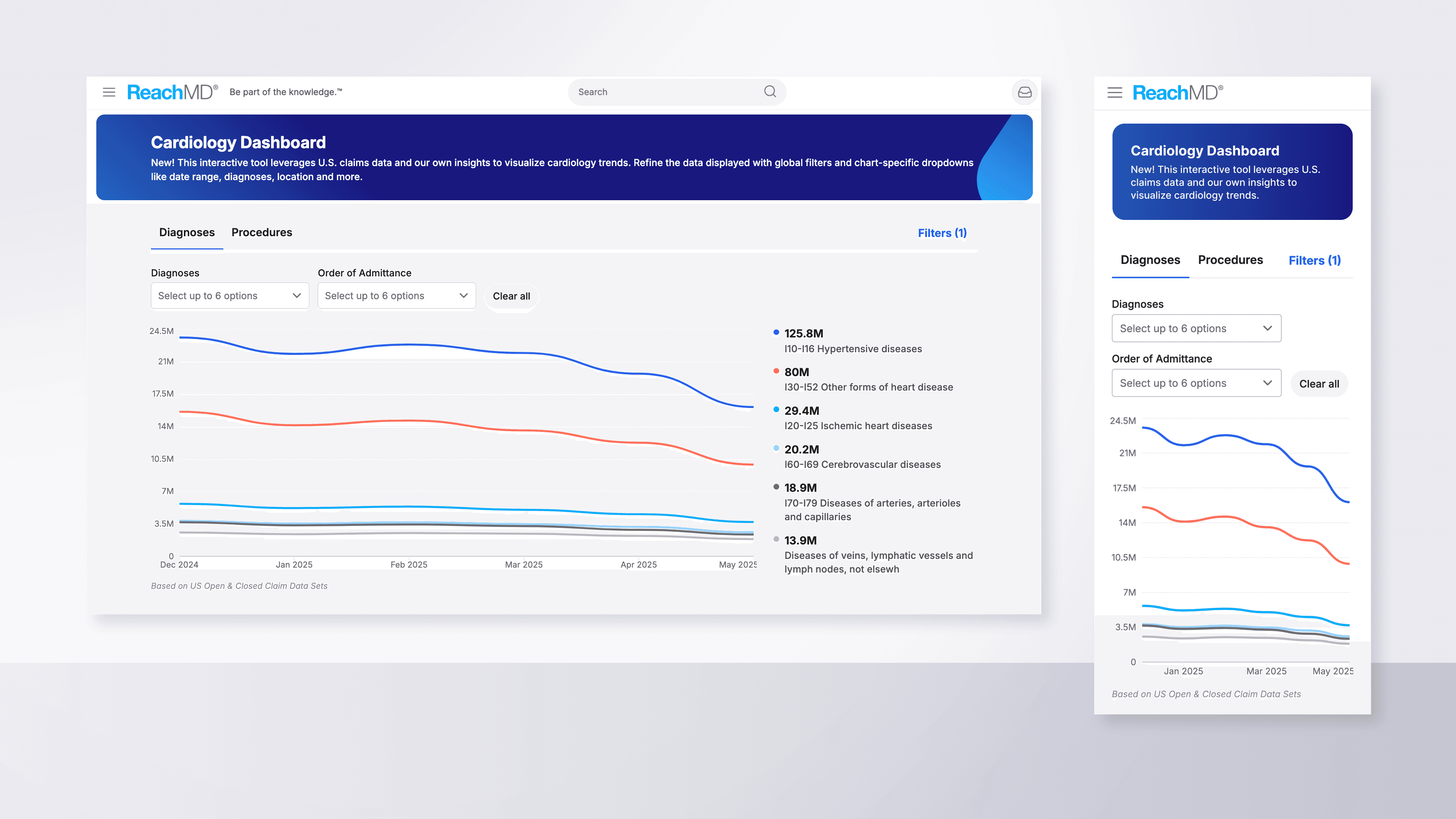
The proposed feature, the Cardiology Dashboard, was designed to help users explore monthly cardiology trends across diagnoses and procedures. My challenge was to create an interface that turned extensive data into an interactive, professional experience that reflected the brand’s visual standards. From a UX perspective, interactive visuals create a sense of discovery. When users can explore data themselves, they feel more engaged than they would reading static numbers.
Responsibilities
Dynamic Data Visualization
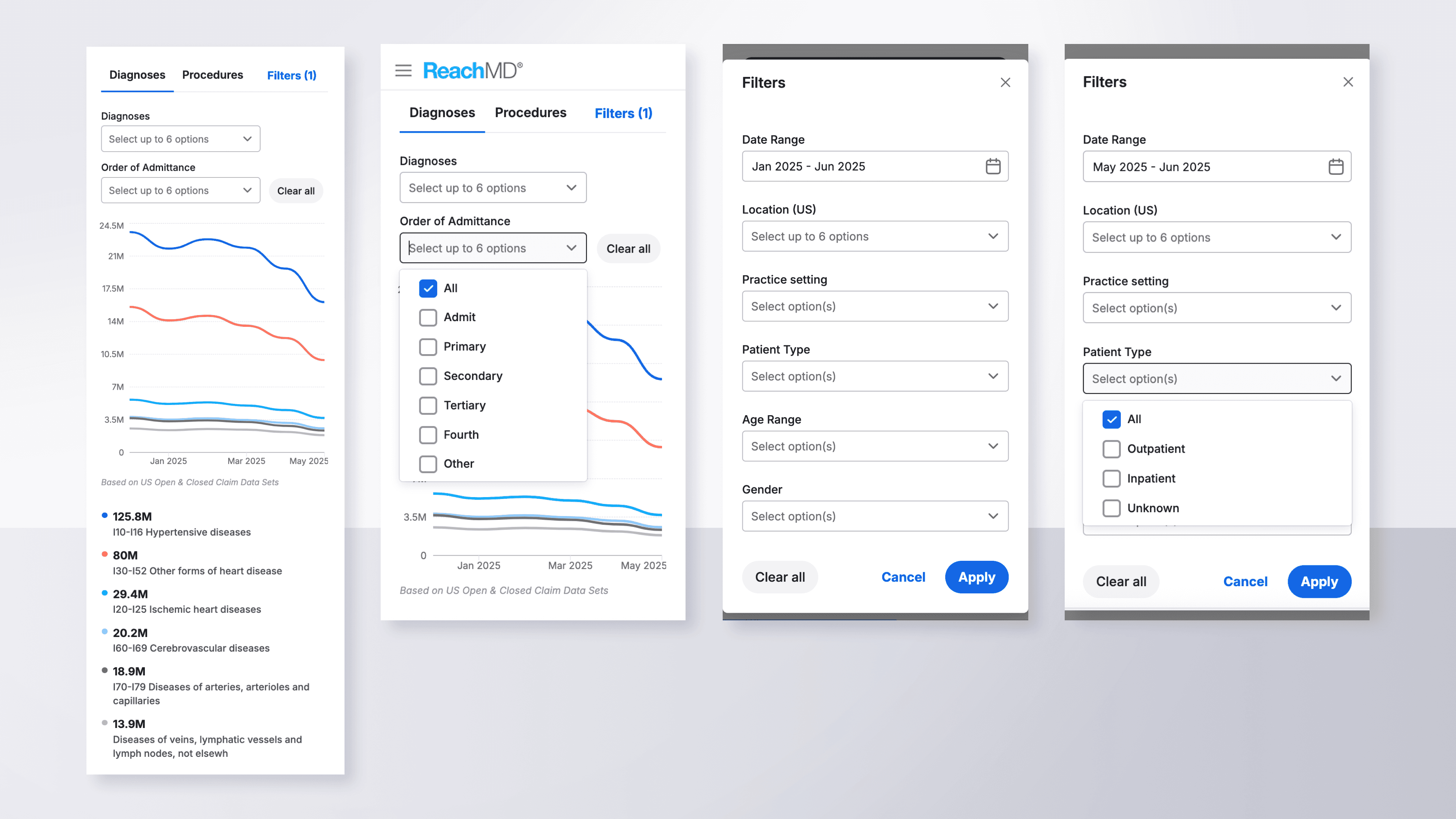
The first step was designing modern data visualizations in Figma, divided into two categories, Diagnoses and Procedures. Each was placed in its own tab with filters for exploring sub-categories and toggling visibility.
Interaction-Boosting Features
To increase interactivity, I added a chart legend that appeared on hover to reveal monthly values, paired with smooth motion tracking. I also designed multi-picker dropdowns that allowed users to explore different subsets of data efficiently.
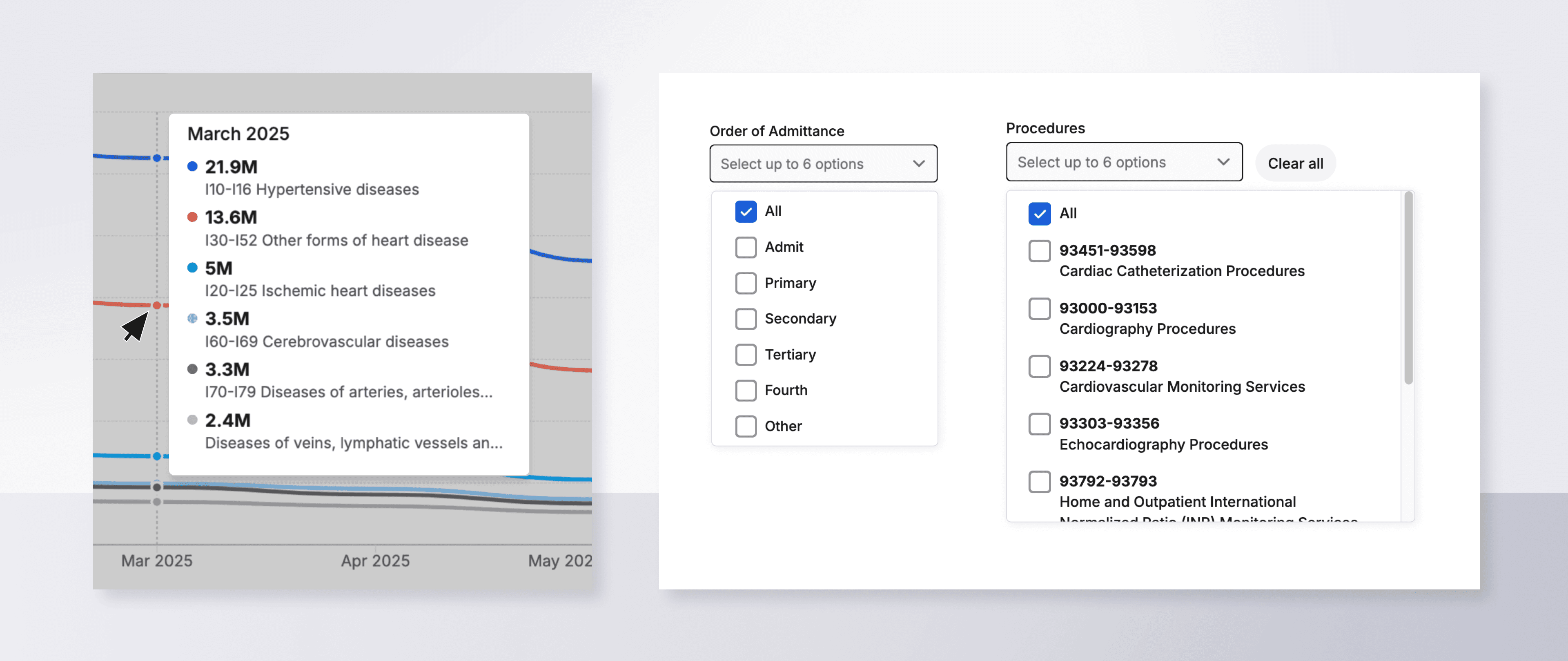
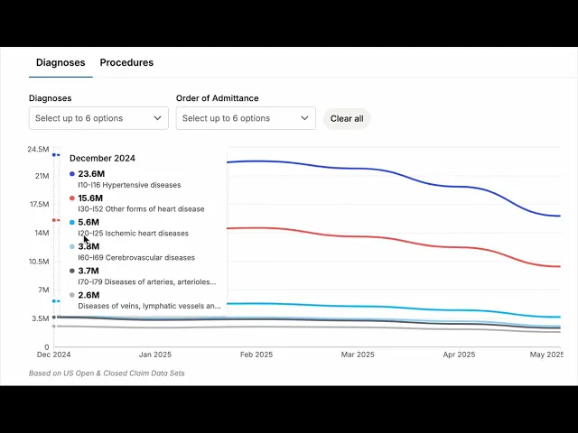
Video: The chart legend appears on hover and shows data for individual months. Motion tracking enables it to slide with the users movements.
Advanced, Multi-Point Filtering
A core feature of this tool was advanced filtering, enabling deeper exploration by date range, location, and age group. I created a pop-up module housing six responsive filter types, each tailored to the data format.
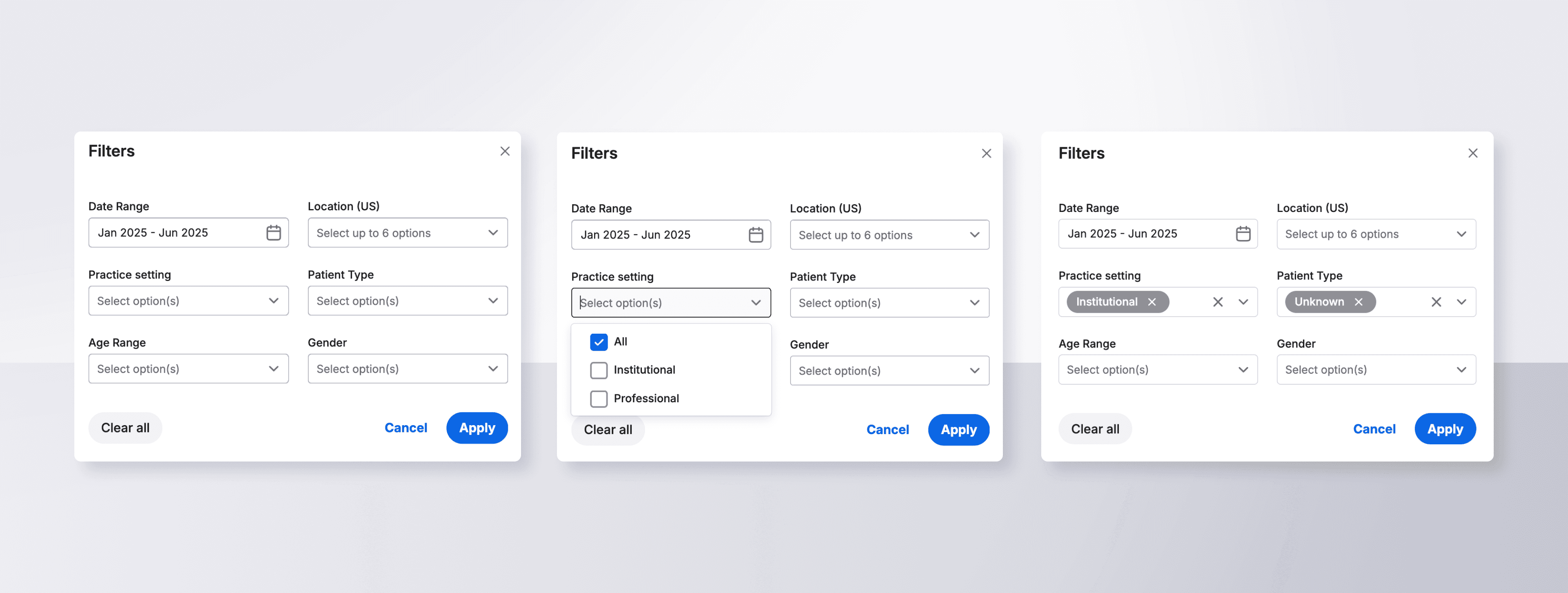
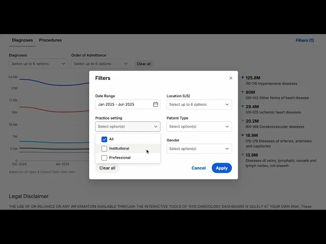
Video: Advanced filters in a pop-up module allow users to explore a variety of visualizations.
Responsive Mobile Layouts
Alongside desktop layouts, I designed responsive mobile versions using Figma’s Auto Layout, variant libraries, and prototype features to ensure scalable and accessible designs.
Results
A successful launch! The dashboard turned a large body of ever-updating data into an approachable and dynamic visual experience.
📊
Increased interaction with regularly updating, data-driven content
✅
Engagement encouraged by a powerful filtering system
👍
Feature adoption boosted by clear visualizations and on-brand colors
The Cardiology Dashboard launched in early 2025 as part of the company’s suite of digital tools for healthcare professionals. It continues to attract regular use among cardiologists and serves as a model for future dashboards in other specialties.
From a UX perspective, this project demonstrated how thoughtful data visualization can transform static information into an active learning experience. By giving users interactive control over what they see, engagement naturally increases because users feel ownership over their exploration.